
When it comes to creating your nonprofit’s brand assets, you’ll need to define plenty of different factors, some of which include your organization’s official colors, slogan, and fonts. One of the most vital elements you’ll need to put thought behind is your nonprofit logo.
Your nonprofit’s logo represents your organization’s mission and appears across different brand creatives, including everything from your website and social media to fundraising solicitation letters and employees’ business cards.
Your logo is deeply connected to your nonprofit at every turn, so it’s crucial that you take the time to create one that accurately reflects your cause and will be immediately recognizable to supporters.
If you need some inspiration for your design, you’ve come to the right place! Based on our experience with nonprofit graphic design, we’ve pulled together some of the best logos out there, broken down into the following categories:
- Animal Rights and Environmental Conservation
- Arts and Cultural Organizations
- Human Rights Organizations
- Medical and Healthcare Organizations
- Religious Organizations
- School and Educational Groups
- Youth Development and Protection Programs
At Kwala, we specialize in nonprofit graphic design. We regularly work on brand creatives, including nonprofit logos, which allows us to understand the elements that comprise an effective design. We’re excited to share some of our favorite ones across the sector, helping to spark your team’s inspiration!
Feel free to explore the individual sections that align with your nonprofit to see how similar organizations convey their missions, or explore every section to see how designs align and vary across different fields.
With that, let’s jump in!
What makes a good nonprofit logo design?
Before creating a nonprofit logo or looking at examples, it’s vital that you understand the individual elements that come together to form a cohesive, captivating design.
To design a memorable nonprofit logo, you need to revisit your brand guidelines, choose the right color palette, stick to readable fonts, and make sure any symbols you include represent your mission.
Let’s break down some of the individual components of effective nonprofit logo design, so you’ll be able to pinpoint them in the different examples we share later on.
Nonprofit Logo Design Element 1) Mission-Centric
Your logo should embody your organization’s mission as much as possible. Review your mission and vision statements and reflect on how you can illustrate them in your design.
What symbols, images, or words are commonly associated with your cause? Being able to encapsulate your cause using a few elements will result in a clear visual representation of your nonprofit’s work.
Nonprofit Logo Design Element 2) An Effective Color Palette
Colors play a vital role in communicating your nonprofit’s message. While there are a few things you’ll want to keep in mind regarding color, you’ll primarily want to remember that different colors evoke different emotions in people.
Here’s a quick overview of some of the most popularly used colors in nonprofit logos:
- Red can create a sense of urgency, energy, love, violence, or aggression. You often see these with disaster relief, lifesaving, health, and anti-violence organizations.
- Green is often associated with the Earth and growth, which is why you see it primarily used with environmental-focused organizations.
- Blue conveys a sense of safety, professionalism, power, calmness, and dependability. You often see it associated with water and peace organizations.
- Yellow is a warm color often used to represent youth, energy, and feelings of happiness. Use it sparingly as it can be overpowering. Instead, use it to highlight important elements in your nonprofit logo.
- Black gives off the allure of sophistication, authority, and seriousness. You’ll recognize this color in logos for nonprofits that want to convey widespread action, such as the World Wildlife Fund or WildAid.
The colors you include in your nonprofit logo can impact the way people perceive your nonprofit, so choose them carefully!
What’s more, you’ll want to stick to around 2-3 colors. This will help to keep your design simple and not visually overstimulating. Plus, it’ll cut down on printing costs and easily carry your logo’s depth across different marketing materials — whether you use it on t-shirts, postcards, or decals.
Nonprofit Logo Design Element 3) Readable Fonts
If you’re planning on using text in your nonprofit logo design, the font you use plays a major role in the message you convey. By changing the font, you can completely alter the mood you elicit in supporters.
There are four types of fonts you should be aware of, including:
- Serif fonts: As a traditional and sophisticated font, a serif logo font will help communicate timelessness and legacy.
- Sans serif fonts: Easy to read and modern, a sans serif font will help create a minimalistic design. These fonts are a go-to for their crisp readability.
- Cursive fonts: Often more formal, cursive fonts can convey elegance. Be wary when using this type of font since it can cause legibility issues when you resize your nonprofit logo.
- Script fonts: These look more like real handwriting and calligraphic lettering. Depending on the exact font you use, they can either be more formal and elegant or informal and playful.
If an existing typeface doesn’t suit your nonprofit’s brand, you might opt to design your own font. This will help to create a custom logo that stays unique over time. While more time-intensive to create and harder to pull off, you can create a distinctive logo for your brand.
Overall, a memorable font can help distinguish your nonprofit from others and create a nonprofit logo design that will resonate with your audience.
Nonprofit Logo Design Element 4) Simplicity
With so many elements that need to be included in your design, it can be challenging to create a nonprofit logo that’s not overloaded. However, a simple design is key to creating a visually-pleasing logo that sticks out to prospects.
Sit down with your design team and determine what colors, symbols, and words are most meaningful to your mission. Subtract unneeded elements until your graphic design represents your work in its simplest form.
The goal should be to keep it as minimal as possible while still conveying your message. This means avoiding intricate details and using plenty of whitespace so that your design looks clean.
Ultimately, the end result will be a simplistic nonprofit logo that’s more memorable than an overloaded design.
Nonprofit Logo Design Element 5) Memorable and Timeless
When outlining your logo, aim for a classic design that will pass the test of time. While you want to create a fresh and contemporary look for your nonprofit, avoid design trends and instead aim for longevity.
Will it still be an effective design 10, 20, or even 50 years down the line?
The last thing you want is to have to completely redesign your logo from scratch later on. This will waste resources and negatively impact your brand awareness when long-time supporters no longer recognize your nonprofit logo.
Final thoughts: There are a lot of elements that go into creating a timeless and memorable nonprofit logo. If graphic design isn’t your strong suit, rely on a professional design service to capture all of these elements. The experts here at Kwala specialize in graphic design and know what it takes to create the perfect logo that accurately represents your cause. Reach out to our team to get started on your project!
Best Nonprofit Logos for Animal Rights and Environmental Conservation
Animal and environmental rights organizations have some of the most iconic nonprofit logos out there. While some morph animals and other symbols into their designs, others stick to simplistic designs and color combinations.
In these nonprofit logos, you’ll notice a lot of symbols and colors correlated with animals and nature, such as green and blue. Whether they go for a more playful look or a classic and sophisticated look, each organization communicates its cause using carefully picked typography and graphics.
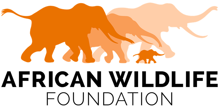
African Wildlife Foundation
American Society for the Prevention of Cruelty to Animals (ASPCA)

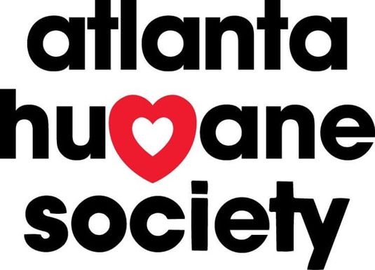
Atlanta Humane Society
Charity: Water
Environmental Defense Fund
Friends of the Fells
Greenpeace
National Park Service
Natural Resources Defense Council
Ocean Conservancy
The Humane Society Of The United States
The Nature Conservancy
TreePeople

Wildlife Conservation Society
World Wildlife Fund
Best Nonprofit Logos for Arts and Cultural Organizations
Designs for arts, culture, and humanity organizations are typically more fun, bright, and visually stimulating. These organizations aren’t quite as serious as healthcare or human rights organizations, which is why they typically feature more artistic and playful designs.
These nonprofit logos typically incorporate artful typography, and you’ll notice they come in an array of fonts and colors. Between strategic usage of whitespace and bold colors, these examples are a bit more creative and abstract than the average nonprofit logo.
Artspace
Brooklyn Academy of Music
Chicago Symphony Orchestra
Contemporary Art Museum St. Louis
Georgia Aquarium
Girls Write Now
Global Peace Film Festival
High Museum of Art
Memphis Zoo
Minnesota Zoo
National Railway Museum
National Wildlife Federation
New York City Ballet
New York Philharmonic
Nonhuman Rights Project
Public Broadcasting Service (PBS)

P.S. Arts
The Freedom Theatre
Best Nonprofit Logos for School and Educational Groups
Schools and academic groups seek to educate and inspire young audiences. That’s why these nonprofit logos combine unique shapes and bright, youthful colors to capture their target audience’s attention.
Many of these organizations took the opportunity to express their creativity in their designs. Notice how these logos exemplify the need to consider your brand’s audience in any of your marketing assets.
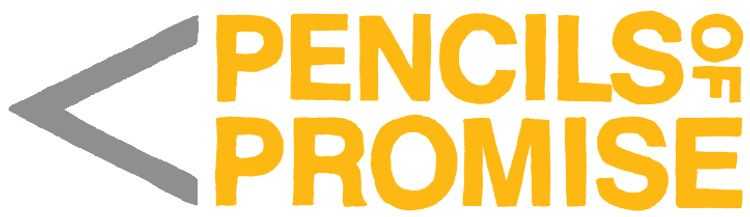
In particular, Pencils of Promise put a unique twist on its nonprofit logo design by formatting its name in the shape of a pencil with yellow and gray colors to match.
Barefoot College International
Connecticut Education Association
The Educators’ Institute for Human Rights
MentorWorks
Pencils of Promise
Room to Read
Salt Lake School of Theology
Save the Children
Stand for Children
Teach For America
The Mentoring Project
The New Teacher Project
Best Nonprofit Logos for Human Rights Organizations
Humanitarian groups devote their time to bettering people’s lives and society as a whole. Because these groups tend to operate on an international scale, they primarily use limited text and recognizable icons in their nonprofit logos to avoid creating overloaded designs. They focus on simplicity to communicate their missions.
By combining universal symbols with carefully chosen colors, these designs communicate togetherness, growth, and societal progress.
American Heart Association
American Red Cross
Americares
Anti-Defamation League (ADL)
Breaking Ground
Feeding America
Goodwill
Habitat for Humanity
Human Rights Campaign
One Drop Foundation
(Red)
Salvation Army
UNICEF
United Way
Volunteers of America
Water for People
Best Nonprofit Logos for Medical and Healthcare Organizations
Medical and healthcare organizations need to strike a balance of professionalism and comfort, inspiring those in need to reach out. You’ll notice that some of these nonprofit logos embrace a bright playful side while still communicating their core purpose of providing care.
Many of these logos use symbols and comforting colors that create a more artistic design. Paired with clear fonts, the icons and colors help to communicate openness and comfort without diminishing the organization’s expertise.
American Medical Association
Breast Cancer Research Foundation
Children’s Miracle Network Hospitals
Doctors Without Borders
Infusion Nurses Society
International Association of Rehabilitation Professionals
Medic Mobile
Mental Health America
Mothers2Mothers
Seattle Children’s Hospital
St. Jude Children’s Research Hospital
Stand Up To Cancer
World Health Organization
Best Nonprofit Logos for Religious Organizations
Faith-based organizations aim to create elegant logos that inspire their followers to come together. Many of these designs use conceptual designs, unique typography, and religious symbols to communicate their causes without being overwhelming.
While many nonprofits infuse playful colors into their logos, religious organizations tend to stick to modest colors. Bold designs can otherwise compromise the level of grace and humility that faith-based organizations must bring to their work.
Catholic Charities USA
Catholic Relief Services
Fellowship Dallas
Focus on the Family
Jewish Funders Network
Ministry Watch
Open Doors
Redemption Church
Tim Tebow Foundation
Young Life
Best Nonprofit Logos for Youth Development and Protection Programs
Youth development organizations have some of the most recognizable nonprofit logos out there. Their timeless designs lean into symbolism, resulting in slightly obscure designs that stick in supporters’ minds as they decipher their meanings.
As a result of these captivating designs, you might already recognize some of these nonprofit logos, such as Girl Scouts or The YMCA.
4-H
Big Brothers Big Sisters
Boy Scouts
Boys & Girls Club
Bronx Connect
Children International
Do Something
Every Child Oregon
Girl Effect
Girl Scouts
Harlem Children’s Zone
The Trevor Project
Thorn
YMCA
Wrapping Up
Nonprofit logos are one of your brand’s biggest assets, so it’s vital that you invest time into creating the perfect design. That’s why we curated this list: to inspire you on your logo design journey!
To create a nonprofit logo that truly encapsulates your cause, turn to the experts here at Kwala! Our team will take the time to make sure we have a deep understanding of your cause so we can design an eye-catching logo that will stick with supporters. Plus, we’re happy to work with you until we get the design exactly right!
Backed by our experts, you can create a timeless logo that will spread brand awareness for years to come. Get started with Kwala so you can jump into your nonprofit’s graphic design journey today!
If you want to dive further into the world of graphic design, check out these great resources:
- Graphic Design for Nonprofits: What To Know & 10 Free Tools. Effective graphic design can elevate your mission and take your marketing to the next level. Explore the basics of nonprofit graphic design and learn about some of the best free online design tools.
- Nonprofit Marketing Ideas: Promote Your Cause Effectively. Your nonprofit logo is one of your most crucial marketing assets. Explore other great marketing ideas with this complete list.
- Microsoft Ad Grants: Everything Your Nonprofit Needs to Know. Unleash the power of digital marketing by enrolling in Microsoft’s ad grant program.