As of 2022, The National Center for Nonprofits in the U.S. reports more than 1.5 million registered charities in America. With such a large number of comparable organizations, how does your nonprofit compete?
Maybe it’s time to consider advancing your organization’s awareness with a detailed nonprofit branding strategy. There’s a reason why Coca-Cola spends $4 billion annually on advertising. The cursive white letters against Coke’s signature cherry red don’t just visually represent the brand, they showcase the refreshing feeling of drinking the soda.
Of course, you’re not here to sell Coke or any other drink for that matter, but as a nonprofit, you offer priceless services to your community. To connect with more volunteers, donors, and those in need, it’s essential that your organization becomes quickly recognizable. Effective nonprofit branding is the key to unlocking those potential connections.
In this guide, we will cover everything from branding basics to how to build an unbeatable nonprofit brand kit. Here’s an overview:
- Nonprofit Branding Basics
- Why Branding Matters for Your Nonprofit
- Building Your Nonprofit Brand Kit
- Working with an Agency
- Stellar Nonprofit Branding Examples
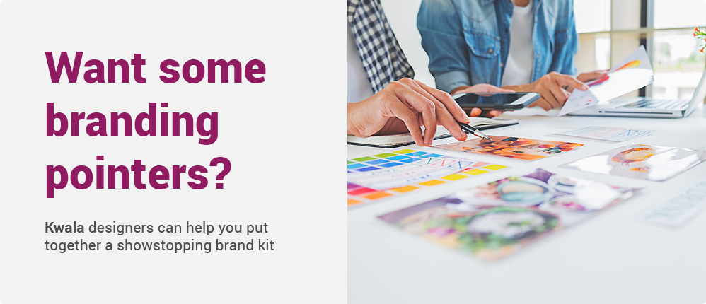
If your nonprofit needs expert help, Kwala can give you the edge you need to create a memorable brand. Our graphic designers have worked with charitable organizations for years and fully understand what it takes to stand out with your marketing materials. Reach out to learn more about how we can help establish your organization’s brand.
In the meantime, we’re happy to share some of what we’ve learned over the years, empowering your team to connect with supporters through effective nonprofit branding. Let’s get started!
The Basics
Nonprofit branding is visual storytelling. It’s your means of communicating your mission and values. It’s what makes your nonprofit unique–giving it a distinguishable flair. With a defined brand, your nonprofit advertises its heart for service through an intangible persona.
Your brand is how you introduce yourself to others and gather support. Specifically, it’s how donors, volunteers, and board members visually identify your nonprofit. Additionally, your brand is how outsiders can learn more about your organization. Seeing your logo piques others’ interest and makes them excited to get involved.
It’s easy to assume high-quality branding is exclusively for commercial companies. However, distinct branding separates well-known nonprofits from obscure ones. For example, the Humane Society International logo mark perfectly captures its values. The thoughtful wildlife image and identifiable font communicate their promise to advance animal welfare worldwide.

Besides attracting visual notice, there are some other major benefits that a detailed branding strategy can bring. Let’s explore those below.
Why Branding Matters for Your Nonprofit
Maybe you’re thinking branding sounds like too much hassle. However, the data suggests that the specificity is totally worth it. In fact, a strong brand is indispensable to building operational capacity, forging support, and marketing your social mission.
Your brand can help you in the following ways:
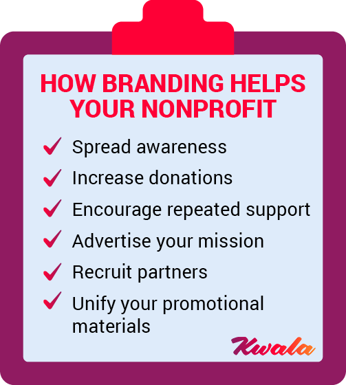
- Spread awareness. Your brand’s logo can both educate and unite people for your cause. A discernible nonprofit look will help separate your nonprofit from other similar organizations.
- Increase donations. The more people recognize your organization, the greater the likelihood that they will donate. This increases your reach, which increases your access to potential donors.
- Encourage repeated support. Donors and volunteers are more likely to give to a nonprofit they are familiar with. Your brand provides a visual reminder to donors, encouraging recurring support.
- Advertise your mission. Your chosen brand elements should directly tie into your mission. For instance, most wildlife-related nonprofits include graphics of or nods to animals. This way your nonprofit brand becomes a visual shortcut for marketing your mission.
- Recruit partners. Other stakeholders besides donors are necessary for your nonprofit’s growth. Event attendees, members, and board members are all necessary recruits to build your nonprofit. Get their attention with your impressively designed brand.
- Unify your promotional materials. If your nonprofit is newer or undergoing a nonprofit branding overhaul, you may be in the process of implementing a full-blown marketing plan. This can involve building or refreshing your website, preparing printed materials, and creating social media graphics. Adding unified brand elements keeps your promotional efforts consistent and identifiable.
Now that you know the many benefits of a robust nonprofit branding strategy, let’s jump into how to structure a reliable brand kit.
Building Your Nonprofit Brand Kit
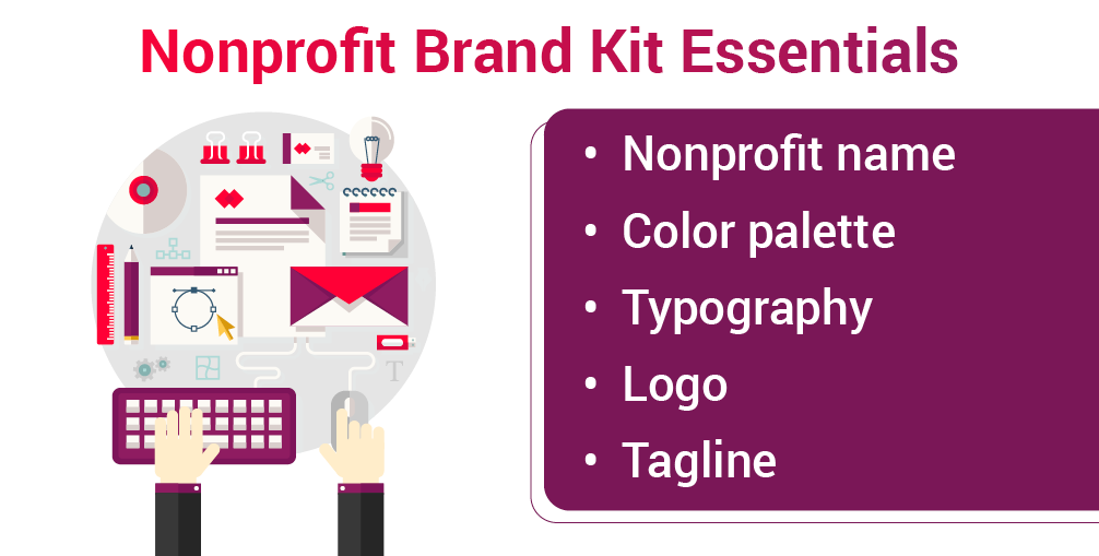
Brand kits are simply a compilation of the visual elements that represent your nonprofit brand. Think of them as a set of outlined rules which dictate how your nonprofit will look, feel, and sound to the world. These visual rules are best kept in an accessible document that can be quickly referenced or updated when creating new marketing campaigns.
The goal of every brand kit is to form a cohesive, distinguishable visual identity. The more detailed you are, the more identifiable and consistent your nonprofit brand will be. Brand kits include but are not limited to your nonprofit name, color palette, typography, logo, and tagline.
Your Nonprofit Name
Choosing a name for your nonprofit is arguably one of the most challenging and important branding steps. Maybe your nonprofit goes by different names based on which region it occupies. Perhaps you have several name iterations depending on who is referencing your organization.
Whatever the case is for your organization, specificity matters. Word associations, nicknames, abbreviations, and acronyms are all aspects to consider when nailing down your nonprofit’s name.
For instance, the YMCA, or Young Man’s Christian Association, has recently rebranded itself as simply ‘The Y’. Branding efforts include the tagline, “Find your Y”. This change was partly because the organization had become so familiar that the community shortened its name from an abbreviation to a single letter.
If you are searching for the perfect nonprofit name or are evaluating the effectiveness of your current name, here are some questions to consider:
- Does my nonprofit name align with my mission?
- Is it memorable and descriptive?
- Is it best reflected in a full title, abbreviation, or acronym?*
- Is the name available to be used?
- Does it resonate well with my target community? Will they understand it?
*Note: aim for an abbreviation before an acronym. Your audience may not be as familiar with your nonprofit lingo as you are.
If you answered yes to these questions, you have most likely secured a fitting name for your nonprofit. If not, you should consider brainstorming some alternative titles.
Color Palette
Did you know that color can improve your brand recognition by up to 80%? To maximize this recognition, it’s best to keep a limited palette. Most brands only have 2-3 colors. Keep in mind that you will most likely have one primary color with one or two more neutral accent colors.
Below is a color wheel that illustrates which brands use which colors. Using this as a reference can help you visualize which colors are right for your nonprofit.

Still not sure which colors work best? Let’s examine some subconscious color psychology. Here are some common color associations to consider when choosing your nonprofit’s brand colors:
- Green: often associated with growth stability. Nonprofits like the Nature Conservancy use this color to evoke a connection to the natural world.
- Blue: exudes trustworthiness and openness. Many medical organizations use light blue in their branding. Dark blue symbolizes professionalism and formality.
- Purple: tied to royalty, uniqueness, or wisdom. Nonprofits like the Purple Heart Foundation use this color to specially recognize veterans.
- Red: associated with passion, anger, or excitement. Red often represents immediacy as seen in the American Red Cross logo.
- Orange: symbolizes playfulness and friendliness. Orange logos such as the Best Friends Animal Society have a fun, light-hearted flair.
- Yellow: capable of exuding both sunny optimism and highlighting important, attention-worthy causes Amnesty International and International Rescue Mission both use yellow to call attention to human rights crises.
- Black: associated with a more modern, expensive, or edgy feeling. Most lettering is black to provide noticeable contrast.
- Grayscale: represents a more subdued form of black which can be seen as neutral or mysterious. Gray is usually an accent color.
Regardless of which colors you choose for your nonprofit, it’s important to remember that some colors are associated with particular causes. For example, pink is used to signify breast cancer awareness, and red is commonly used for heart disease.
Lastly, ensure your colors meet contrast and accessibility standards. If you have two colors of a similar value, it creates readability issues. Choosing contrasting colors helps others clearly see and identify your defined visual identity.
Typography
When considering fonts, there can be an overwhelming number of similar options. However, even the smallest letter change can completely alter your nonprofit’s tone.
Aside from tone, the most critical aspect when selecting your font is readability. When you’ve found the right combination of mood and readability, you’ve hit the perfect typographic harmony.
There are four different types of fonts to be aware of when building your nonprofit branding strategy, including:
- Serif fonts. As the traditionalist of the group, serif fonts are sophisticated and timeless. They communicate undertones of legacy and importance.
- Sans serif fonts. These fonts are most commonly selected for their readability and modern feel. When using sans serif fonts, nothing will obstruct your message.
- Cursive fonts. Formal and elegant, cursive fonts possess a creative flair. However, be wary of cursive fonts because they can be difficult to read, especially in smaller sizes.
- Script fonts. Mirroring handwriting or calligraphy, these fonts have a more personal flair. Script fonts can vary from formal to playful depending on the chosen lettering.

Hierarchy is the final aspect to consider when completing the typography section of your brand kit. Implementing two different font weights within the same font family is a great way to highlight primary information. Light, medium, and bold variations effectively break up text and simplify your message.
Logo
Logos are the amalgamation of your other visual elements. Your name, colors, font choice, and additional symbols are all pieces of your logo. Because your logo symbolizes your entire organization, creating one that accurately represents your cause and connects with supporters is essential.
There are three common variations of logos: a symbol, a wordmark, and a combination mark. Most nonprofit organizations use a combination mark that includes an identifiable nod to their mission. For instance, The World Wildlife Fund uses their famous panda as a symbol to capture their organization.
If you are unsure about which logo type is right for you, visually experiment with different iterations. A slight change in lettering, size, or symbol selection can offer an attractive visual alternative.
Tagline
A tagline is a concise phrase that captures your mission in a memorable way. The phrase could be written in various tones: imperative, descriptive, provocative, superlative, or interrogative. Your tone will differ depending on your organization’s mission and cause. If you’re brainstorming your first tagline or rewriting a current one, we’ve answered some common questions you may have.
Do nonprofits really use taglines?
Believe it or not, most nonprofits have taglines. In a survey of more than 1,800 nonprofits, 73% had a chosen tagline. Taglines are great ways to differentiate your nonprofit from other comparable organizations.
What makes a great nonprofit tagline?
Taglines should be branded with your name and logo in mind. Your tagline should be consistent across all of your marketing materials. Once you’ve landed on the perfect phrase, use the three C’s—clear, concise, and catchy—to determine your tagline’s effectiveness:
- Clear. A strong tagline is straightforward and descriptive. Think about reading recipes–when you’re cooking, you want simply written directions. If just one word is missing or misused, you could end with a completely different dish! In the same way, you want your tagline to be crystal clear.
- Concise. When writing taglines, brevity is key. Most taglines are no longer than seven or eight words. Many times, brief taglines are not the first ones you think of. That’s okay! Write down your ideas, and shorten them from there.
- Catchy. Quick taglines are attention-grabbing. Take Rice Krispies’ “Snap, Crackle, Pop” for example. This phrase engages your sense of hearing so that it sounds like you are about to take a bite out of their sweet treat. When considering taglines, let your creativity shine through.
Once you’ve struck the perfect balance of these elements, you’ll have a memorable tagline as part of your nonprofit branding strategy.
What are some examples of strong nonprofit taglines?
Sometimes the best way to start drafting your tagline is by learning from others. If you could use some inspiration, we’ve listed some of our favorite nonprofit taglines:
“Starve fear. Feed hope.”
- Nonprofit: National Eating Disorders Association (NEDA)
- Tone: Imperative. The NEDA uses this tone to command attention and request immediate action.
- Why we like it: This tagline is brief but brimming with meaning. NEDA thoughtfully reframes the words “starve” and “feed” to further its mission of helping families affected by disordered eating.
“Helping preserve the places you cherish”
- Nonprofit: Land Choices
- Tone: Descriptive. This tagline clearly describes Land Choice’s mission and offers a glimpse into its passion for preservation.
- Why we like it: With six words, Land Choices clearly communicates its nonprofit’s purpose. The use of the word “cherish” also elicits a protective, emotional response to nature.
“For every child”
- Nonprofit: UNICEF
- Tone: Descriptive. UNICEF wastes no time describing who this nonprofit benefits and why it was created. It’s perfectly clear and concise.
- Why we like it: Although it’s not action-oriented, UNICEF’s incredibly short tagline still tugs at your heartstrings. Your attention is immediately focused on child rights.
Agency Partners
If building your own nonprofit branding kit from scratch feels overwhelming, that’s okay! Maybe your nonprofit doesn’t have a dedicated marketing team, or maybe you need an outside perspective to strengthen your organization’s visual identity. When it comes to defining your brand, there are several decisions to make, and you want your brand to feel like you.
Working with a nonprofit branding agency may be a better use of your time. Agencies can provide you with an expert second opinion and offer relevant nonprofit branding strategy assistance rooted in real-world experience. They’ll help you hone your messaging and visual identity to create a strong, engaging brand for your organization.
If you want unlimited graphic designs for your nonprofit, partner with Kwala! We offer:
- A dedicated designer who will get to know your mission
- Unlimited graphic design requests and revisions
- A flat monthly fee
- Full ownership of designs
- Web and print graphic designs for all of your needs
With years of experience in the sector, we know what it takes to make your nonprofit brand stand out among other organizations. Reach out to get started solidifying your organization’s identity.
10 Branding Examples
Forming your nonprofit brand kit is a lot like building your nonprofit’s distinct personality. Everything from your marketing materials’ tone to its visual appearance communicates your organization’s unique positioning. Memorable, thoughtful brand personalities stand out from plain, inconsistent ones.
After all, if there are other similar nonprofits out there, your brand should reflect why your organization is specifically needed. An effective brand strategy will confidently answer this question. Let’s examine some inspirational examples of organizations that beautifully executed their nonprofit branding strategies.
Winshape Foundation

Who they are: Winshape foundation is a Christian nonprofit set up by Truett Cathy to minister to college students to “shape winners.” Since then, the foundation now serves through various other programs: Winshape Camps, Winshape College Program, Winshape Homes, Winshape Marriage, and Winshape Teams.
Why we love their nonprofit branding: WinShape has several programs so they should not visually box themselves in for one specific program. Their red logo does a great job of referencing the community without excluding anyone. The readable font and slight color variations are also straightforward and a nod to their partner, Chick-fil-A’s branding.
Shelter England

Who they are: Shelter is dedicated to providing housing for Children in England and Scotland. Their website reads “one child waking up without a home is a tragedy, 120,000 is an outrage”. This nonprofit strongly believes in the right to a safe home.
Why we love their nonprofit branding: Simply put, this branding is smart. The red communicates the urgent tone of their mission. The h’s pointed roof is effective without being redundant by providing an intriguing visual element.
International Rescue Committee

Who they are: The International Rescue Committee (IRC) works in over 40 countries and in 28 U.S. cities to help people affected by humanitarian crises survive and rebuild their lost lives. They have a current campaign running for Ukraine.
Why we love their nonprofit branding: The IRC logo creates an effective visual hierarchy by emphasizing the most relevant word “rescue” with large, bold lettering. The choice of yellow and black signals the nonprofit’s immediacy and matches its tone.
The Water Trust
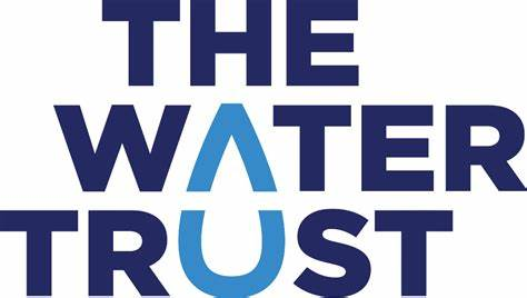
Who they are: The Water Trust works with communities in Uganda to further sanitation, housing, and hygiene efforts. They build infrastructure and homes so that Ugandan families can thrive.
Why we love their nonprofit branding: When it comes to logos, sometimes it’s best to go for the obvious. The variations in blue create hierarchy, and the raindrop stimulates visual interest.
Feeding America
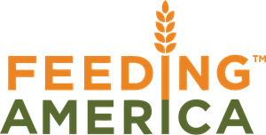
Who they are: Feeding America works to get food to American communities in need. They partner with 200 food banks and 60,000 food pantries to end hunger in the U.S.
Why we love their nonprofit branding: Feeding America’s colors are reminiscent of crops in a field. Additionally, their wheat is a great symbol that carries their message and visually connects the idea of providing nourishment to America.
Friends of The Fells

Who they are: Friends of The Fells are a group of individuals advocating for the protection, appreciation, and sustainable enjoyment of the Middlesex Fells Reservation in Massachusetts.
Why we love their nonprofit branding: Their natural color palette evokes the feeling of being in the outdoors. The Friends of the Fells’ logo is a smart use of the double fs facing outwards to create a tree.
Second Helpings Atlanta
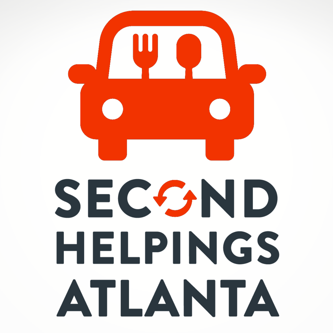
Who they are: Second Helpings Atlanta is a nonprofit food rescue organization with a mission to reduce hunger and food waste by redistributing Altanta’s surplus foods. They connect food donors, partner agencies, and volunteers to strengthen food security in the Atlanta area.
Why we love their nonprofit branding: The Second Helpings Atlanta logo imaginatively pictures their mission of food redistribution. The “o” within “second” is a great visual to link the organization’s efforts to reducing waste.
The Backpack Project

Who they are: The Backpack Project (TBP) is a nonprofit seeking to make homelessness “rare and brief” by providing backpacks full of living essentials to those in need. TBP also works to connect homeless people with service providers.
Why we love their nonprofit branding: TBP has a strong mission statement that envisions a world without homelessness. This idea of growth is echoed in their green color palette. Additionally, the zipper is a quick, simplified version of their former backpack logo.
The Mentoring Project

Who they are: The Mentoring Project is a team of volunteers that relies on community support to build a network of expert mentors for students. They partner with a variety of other nonprofits to advocate for student academic success.
Why we love their nonprofit branding: Elephants are usually seen in herds when depicted in branding and in the wild. The Mentoring Project’s use of two relational elephants perfectly imagines the concept of mentoring.
To Write Love on Her Arms

Who they are: To Write Love on Her Arms (TWLOHA) started with the personal story of the nonprofit’s founder, Jamie Tworkowski. This nonprofit exists to give hope and find help for those who suffer from suicidal thoughts, depression, addiction, and self-harm.
Why we love their nonprofit branding: Their nonprofit name reimagines the realities of self-harm and sparks meaningful conversation. Because of this, TWLOHA is smart to keep its brand colors and font simple to let its message shine through.
Final Thoughts
In a sea of organizations pursuing worthwhile missions, a thoughtful nonprofit branding strategy makes your organization recognizable. Because your distinct visual flair is your branded mission statement, it quickly connects you to your audience. Make the most of your branding by keeping it consistent, simplistic, and accessible.
Looking for some more digital marketing resources? Check out these great resources to take your marketing knowledge up a level::
- 15 Best Nonprofit Design Examples. Explore more effective graphic design examples with this article from NXUnite.
- The Essential Guide for Choosing a Nonprofit Design Company. Find an agency that can kick your nonprofit branding up a notch with these strategies!
- Graphic Design for Nonprofits: What to Know & 9 Free Tools. Hungry for more graphic design basics? Look to this article for some pointers and free resources.