
What is Typography?
What exactly is the role of typography in graphic design, and how can you use it to help your business thrive?
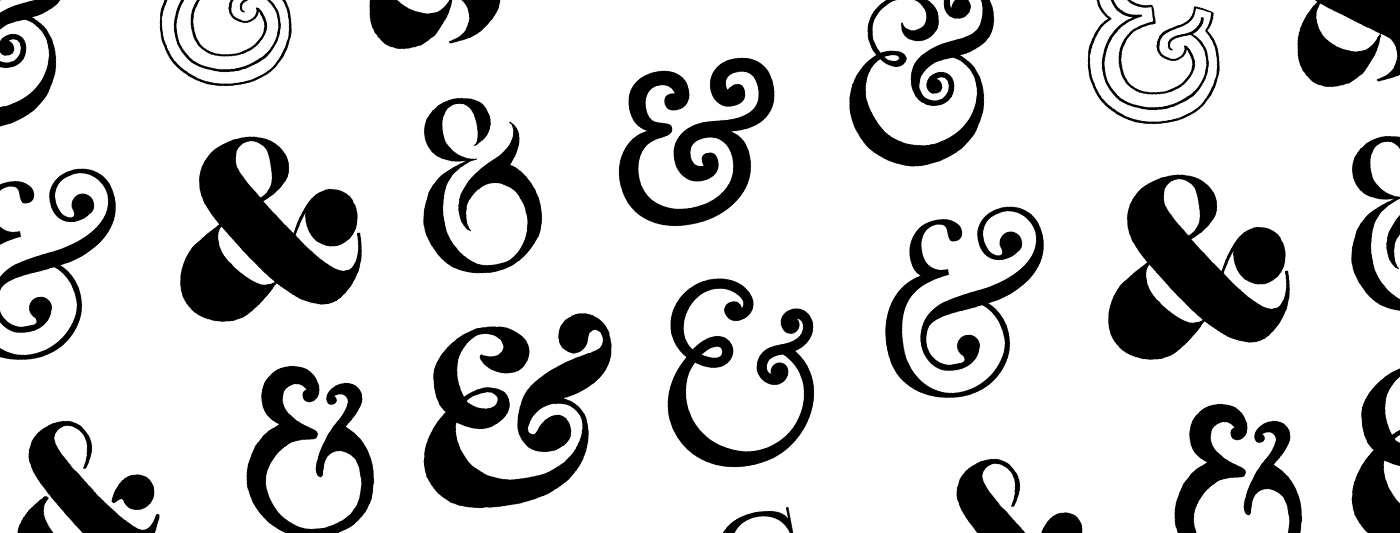
Typography includes everything from custom typefaces for logos or headlines to complete font packages for body copy. While this may seem like a basic aspect of brand design, it’s actually crucially important. Think about some of the most well known and recognizable logos: Google, Pinterest, Aveda, Coca-Cola. What makes them so great? These custom wordmark logos are simply a form of typography. Typography also plays a major role in determining the overall feel and tone of your brand. A strategic, consistent approach to this design form is one of the most essential and foundational ways to achieve a professional, cohesive image for your business.
“I ALWAYS TELL PEOPLE THAT THE DIFFERENCE BETWEEN GOOD TYPOGRAPHY AND [BAD TYPOGRAPHY] IS THE DIFFERENCE BETWEEN WORK THAT LOOKS PROFESSIONAL AND WORK THAT LOOKS LIKE SOMEONE THREW IT TOGETHER IN MS WORD. ONE REASON APPLE’S STORES LOOK SO GOOD IS THE CAREFUL AND CONSISTENT APPLICATION OF [THE TYPEFACE] MYRIAD. BUT KMART’S CARELESS MASH-UP OF HELVETICA, GILL SANS, NEWS GOTHIC AND GOTHAM LOOKS LIKE, WELL, KMART.” JAMES PUCKETT
Typography is a powerful tool that conveys the specific tone and feeling of your business, impacts the emotions and thinking patterns of your audience, and increases the value and interest of your brand.
Let’s take a closer look at why typography is so valuable, and how to incorporate it into your brand!
Why is typography valuable?
Typography does for visual media what the tone of your voice does for spoken conversation. Your voice conveys emotions to the people you’re speaking to — whether you’re happy or sad, whether you’re in a professional environment or at home with friends. The tone of your voice changes to reflect you’re own mood and the circumstances you’re in. Typography does the same thing for your brand – it gives expression and feeling to the words on your screen or page. Typography is essentially the tone of voice in which your message is said. Happy, sad, informative, professional, friendly, elegant … all of these moods and tenors can be conveyed through typography.
But typography does more than just give expression to your words. Studies have shown that good typography design can also spark creative thinking, encourage positive emotions, and reduce visual fatigue and eye-straining. That makes it a powerful force to help you get your audience to stay longer, process more, and leave happier!
Is typography important for boosting your business? Absolutely! But how do you get started incorporating it into your brand?
How to incorporate Typography into your brand?
There are three key points that will help you succeed in using typography effectively for your business. (1) Choose a typeface that supports your brand values, (2) use it in a way that is clearly legible, and (3) stick consistently to your choice.
1. Choose a typeface that supports your brand values.
The look of the typeface should essentially match the message you’re communicating in words. Do you take a fun, playful tone? Pick an open, easy to read font. Are you elegant and high end? Consider using a narrower, tall typeface. If you have a custom wordmark logo, be sure to choose body fonts that support the typeface used in the logo.
2. Choose a legible, easy-to-read typeface.
When selecting your typeface, particularly for any body copy, also keep in mind how easy it is to read. Avoid designs that are too small, intricate or elaborate. You want a design that supports your message in every way — meaning it fits the tone you’re going for, and that promotes and clarifies the message itself! Your words need to be easy for your audience to see, read, and process.
3. Use it with emphatic consistency!
Finally, once you’ve chosen the perfect typeface for your brand, use it consistently. Pick 1-2 fonts to use for your headlines and copy body and stick to them. Using fonts consistently is key to brand recognition!
In conclusion …
Here’s a quick summary of key points to take away and consider as you choose or evaluate your brand typography.
- What tone do you want to convey through your message? Choose a typeface that suits your company’s unique voice.
- What typeface styles and families would best support your brand values? Look for a typeface that reflects your image and resonates with your target audience.
- Is your font easily legible? Don’t make your audience work to read your materials!
- Will your typeface choice work consistently across all your media and needs? It’s important to stick to your font package, so pick a typeface that will work for all of your print, web, and advertisement needs.
