

“Choosing colors for your brand shouldn’t be about your favorite color, but rather what you want your logo to say about your company.” –The Logo Factory
Sad, but true— choosing your favorite color for your brand isn’t always what’s best for your business. Did you know that there’s actually an entire field of science, Color Psychology, devoted to understanding the way color affects people’s emotions and actions? Color is a powerful tool and carries a huge amount of subliminal meaning. Choosing a meaningful, appropriate color scheme for your brand can be difficult, but having a color scheme that works for you and supports your values will be a priceless asset to your business in the long run. Before you pick orange ‘just because you like it’, give some thought to your choice and take into account the hidden messages that each color conveys.
Let’s take a look at some of the common trends in color themes as used by successful business!
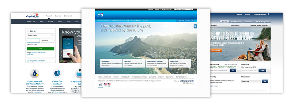
Blue
Banks often use blue as their most prominent color. This is suitable, as blue promotes trustworthiness and security. You’ll also often see that banks use a bright accent color, such as red or orange. Orange conveys friendliness and energy while red often connotes urgency and excitement. This dual-color scheme works perfectly for financial institutions that want to promote safety and security above all else, while maintaining a friendly, energetic feel.
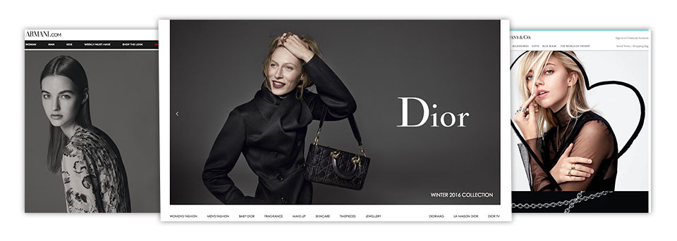
Black
High-end jewelry or department stores often use black, which is commonly representative of sophistication, luxury, and elegance, with an accent color for their brand. Hugo Boss is a good example of a business that uses black as it’s central color. They also incorporate a variety of bright and fresh accent colors such as orange, green, and red to promote their different lines. This scheme relays both the luxury of the brand and the excitement and mood of the individual products. Tiffany & Co uses a black and aqua scheme which combines elements of sophistication, security, and youth.
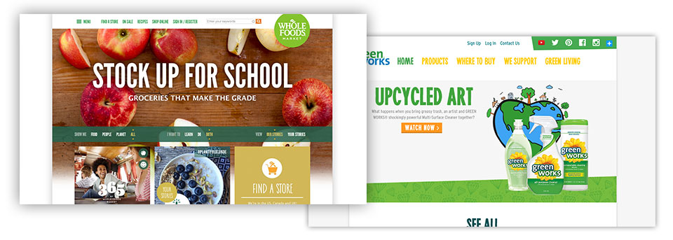
Green
Green is used with yellow, orange or blue by many businesses in the environmental or health food industries. This is a perfect fit — not only because both of these industries are commonly known as part of the ‘green movement’, but also because the color green itself is generally associated with health, freshness, and life. Whole Foods works green, yellow, and orange —along with some brown— very cohesively into their brand for a holistic look. Green Works relies on blue, green and yellow for a fresh, clean, and healthy look.
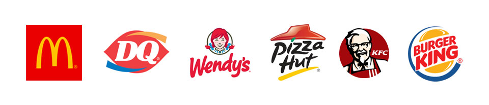
Red and Yellow
Fast food industries heavily rely on red and yellow as their key colors. And not just because these colors perfectly match their condiments — red and yellow are actually considered appetite stimulators, especially when used together. McDonald’s, Pizza Hut, Jack in the Box, Panda Express— it’s a pretty common tale.
So what color scheme is best for your business? Every business is unique, and ultimately the color choice is up to you. However, having an idea of what you want your business to stand for and who you want it to appeal to will help you choose a color that’s applicable to your particular field. Consider answering some of these questions before choosing your color:
1. Who is your target audience?
2. What are the values you want your business to hold?
3. How do you want people to feel when they think about your brand?
4. What colors are your competition using? Do you want to emulate a similar feel, or differentiate from them?
With the answers to these questions in hand, you’re well on your way to picking a color scheme that looks great and supports the core values of your brand. Take a look at my post on color theory to see what each individual color stands for and get started picking your color scheme!
“Before choosing the color for a brand, it’s critical to understand the demographics and psychographics of the intended audience. A 20-year-old, video game-playing male will generally react differently to colors than a 55-year-old mother. Color choice should resonate with the audience. For example, a pastel pink and yellow site color palette would typically be a big turnoff for the first group, but could strongly resonate with the moms.” Patrick Conley, Automation Heroes
